The CleanFinancial guide to charts.
Live Chart
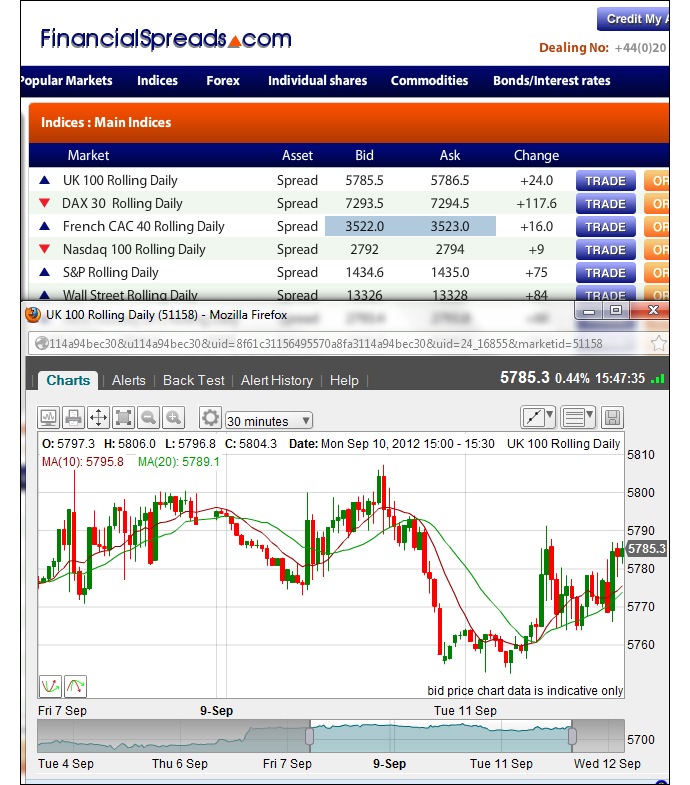
The following chart should give readers a good guide to FTSE 100 (UK 100) prices and trends.If you prefer the candlestick format, click on the candlestick icon
The above CFD chart from Plus 500 is typically based on near-term futures.
If you would live spread betting prices and charts, you will normally need a financial spread betting account.
You can also use a spreads account to access shorter-term daily markets. Readers should note that opening such an account is normally subject to suitability and status checks.
If your account application is accepted then, once logged in, you will be able to access the live charts and prices.
Of course, if you do decide to trade, be aware that spread betting and contracts for difference carry a high degree of risk and you may lose more than your initial deposit.
Accessing More Live Charts
You can use the search function on the above chart to access a wide range of markets:- Stock Market Indices e.g. Dow Jones (USA 30), S&P 500 (USA 500), DAX 30 (Germany 30)
- Commodities e.g. gold, silver, cotton, corn, natural gas and crude oil – note that the chart is for US crude oil rather than Brent (UK) crude oil
- Forex e.g. EUR/USD, GBP/USD, EUR/GBP, USD/JPY and 50 other forex markets
- Digital Forex e.g. Bitcoin and Litecoin
- Shares e.g. you can use above chart to access popular stocks listed in the UK, USA, Australia, Austria, Belgium, Denmark, Finland, France, Germany, Greece, Holland, Hong Kong, Ireland, Italy, Norway, Portugal, Spain, Sweden and Switzerland
- ETFs e.g. like VIX Volatility (VXX), iShares China, Commodity Index Fund etc
Advanced Charts
Although the charting packages normally differ from platform to platform, in order to help investors with their technical analysis most platforms have charts that come with:- A large range of time intervals – 1 minute, 2 minute, 10 minute, 1 hour, 4 hour, 1 month etc
- A variety of chart types – candlestick, line and OHCL charts
- Drawing tools and features – Fibonacci Time Zones, Arcs and Fans
- BackTesting, Tailored Indicators and Analysis tools
- Popular overlays e.g. Ichimoku Kinko Hyo, Moving Averages, Price Channels, Bollinger Bands, Envelopes etc.
- A wide selection of secondary charts e.g. MACD, TSI, RSI, Momentum, Range Indicator, Historical Volatility, Chaikin’s Money Flow, Volume Index, Stochastic etc.
- Email alerts for when your chosen market hits a pre-set level
Example UK 100 (FTSE 100) Chart
Spread Betting Companies that Provide Candlestick Charts
The following spread betting firms provide their clients with candlestick charts.
 |
 |
 |
 |
|
| Candlestick Charts |
 |
 |
 |
 |
Video Guide to Chart Patterns
Below we have a relatively easy-to-follow video on chart patterns from Michael Hewson of CMC Markets who won the 2013 Dow Jones / Wall Street Journal Trading competition.Apart from discussing patterns and examples, Michael talks through useful points on where to set stop losses and price targets (minimum price objective).
For an example on setting Fibonacci Price Projections for GBP/USD and EUR/USD skip to 24:05 minutes.
The video is 53 minutes long, so if you want to skip to a section, we’ve put the times in brackets next to the main topics for you.
Note, he goes a little off topic and talks about the live FOMC minutes (26:10 to 28:00).
Continuation Patterns
- Triangles (fast-forward to 8:00): These tend to be long-term patterns which occur over a 3 week to 3 month periods. Triangle can also be Reversal Patterns. Only trade on the break-out
- Ascending / Descending Triangles (not covered in the video): According to Craig Erlam of Alpari, “Normally a breakout will occur about two thirds of the way into the triangle. In the case of the ascending triangle, the break is typically to the upside”.
- Pennants (13:35): These are short-term signals, e.g. only 5 candlestick periods or a few hours
- Flags (16:05)
Reversal Patterns
- Double Tops / Bottoms (17:50): These work for most time periods but occur more frequently on 1-hour and 4-hour charts. They can be good for setting potential profit levels. Don’t confuse with Double-Resistance or Double-Support
- Triple Tops / Bottoms (32:20): A stronger signal than a ‘double’ but always wait for the breakout
- Head and Shoulders (37:40): These tend to be longer-term reversal patterns and are found more frequently on daily and weekly charts
- Channels (47:35)
Technical Analysis Basics: Support and Resistance Levels
Support levels occur when the market consensus is that the price will not move lower. It is the point where buyers outnumber sellersResistance levels occur when the market consensus is that the price will not move higher. It is the point where sellers outnumber buyers.
The penetration of a support or resistance level indicates a change in investor expectations.
Indices, Equities, Commodities etc can remain in a ‘Range’ for long periods of time and bounce between Support and Resistance.
When a market breaks out of a range the previous ‘resistance’ now becomes a ‘support’ and vice versa.
Technical Analysis Basics: Moving Averages on Charts
- If the price is above its Moving Average, then it is seen as being strong. It may be worth researching the market further with a view to buying it
- If the price is below its Moving Average, then it is seen as being weak. It may be worth researching the market further with a view to selling it
- With short-term Moving Averages you will get a lot of short-term signals
- With long-term Moving Averages, your signal will lag
The Pros and Cons of Technical Analysis
- Past performance does not guarantee future results
- Some traders will also want some leeway when using moving averages. Just because a market has moved above or below its MA it does not guarantee a particular result. If judging a chart on a long-term moving average a trader may wait a few days before making their decision. Many traders will wait for 3 days for a move to be confirmed
- Naturally MAs have their limits but they can be a useful place to start your research
- Using technical elements such as charts can help take the emotion out of trading
- MAs can help to show you when you are betting against the trend. Which you may or may not want to do
Video: How to Use Technical Indicators on Charts
The following is useful video that discusses, in layman’s terms, how four of the popular technical indicators work:- SMI (Simple Moving Average)
- MACD (Moving Average Convergence/Divergence)
- RSI (Relative Strength Index)
- Slow Stochastics
A Different View: Trading the 50 Level of the RSI
Many investors like to treat the 20 and 30 levels of the RSI as potential buy signals (because the market is theoretically oversold).Likewise, 70 and 80 levels of the RSI can be viewed a sell signals (because the market is theoretically overbought).
However, there is a different way of using the RSI. Here’s a look at trading the 50 level:
Candlestick Charts Explained
- As mentioned above, candlestick charts can often be set to focus on your preferred time period eg: tick-by-tick, 1 minute, 5 minutes, 10 minutes, 15 minutes, 30 minutes, 1 hour, daily and weekly
- If you select ‘1 minute’, then a candle represents 1 minute, if you select your time period as 1 hour, then the candlestick represents the market movement for 1 hour
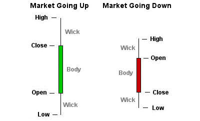
- Candlesticks are normally composed of a body and an upper and lower shadow (or wick)

A Pair of Candlesticks
- The ends of the wick show the highest and lowest traded prices of the market during the time period represented
- The body illustrates the opening and closing prices
- If the market is moving up then the body is shown in one particular colour, in this case, Green. The opening price is at the bottom of the body. The closing price is at the top of the body
- If the market is moving down then the body is shown in another colour, in this case, Red. The opening price is at the top of the body. The closing price is at the bottom of the body
- A candlestick need not have either a body or a wick
Candlestick Charts History
Candlestick charts are said to have been developed in the 1700s by Japanese rice trader Homma Munehisa. The charts gave Munehisa an overview of the opening, high, low, and closing market prices.This method of charting prices proved to be particularly interesting, due to the ability to display five data points instead of one. The method was picked up by Charles Dow circa 1900 and remains in use by today’s financial market traders
Spread betting and CFD trading carry a high level of risk to your capital and you may lose more than your initial investment. Spread betting and CFD trading may not be suitable for all investors. Only speculate with money that you can afford to lose. Please ensure you fully understand the risks involved and seek independent financial advice where necessary.

